
How to make packaging box design that increases sales?

When a product sits on a retail shelf, shoppers rarely spend a long time studying the packaging. In many cases, a few seconds are enough to decide whether to keep looking or put the product back. Attractive packaging matters, but the details that often affect sales are much simpler: Is the product name easy to see? Is the color distinctive? Can shoppers quickly find the key selling point? Consumer research found that 72% of respondents said packaging design often influences purchase decisions, while 67% said packaging materials can also affect their choices.
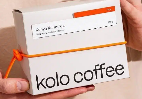
How Can Packaging Box Design Help Customers Understand a Product at a Glance?
When I work on packaging box design, I often shrink the design to see how it looks at a distance. If all that remains is a nice-looking graphic but the product itself is difficult to identify, the design needs more work. A packaging study that collected feedback from 426 consumers also found that visual packaging elements can influence how consumers judge a product and their purchase intentions.
I usually organize the front of the box into clear information levels:
- First, show what the product is: The product name and category should not disappear into complicated graphics.
- Next, show why it is worth buying: Key selling points, specifications, or product functions need a clearly visible position.
- Then, make the brand easy to recognize: Keep the logo and key brand elements consistent instead of changing their placement on every product.
I have seen packaging where designers give most of the surface to decorative graphics while the actual product name becomes tiny. Customers are not judging a design competition. When they shop, they still need to answer one basic question first: “What is this?”
What Colors and Information Layouts Make Packaging Easier to Sell?
Color, typography, and product images should work together. A food product needs to stand out. Skincare packaging often benefits from a softer visual style, while premium gifts may rely more on materials and clean space.
| Packaging Design Element | Common Choice | Suitable Products | Key Consideration |
| Main color | High-saturation colors | Snacks, candy, beverages | Long-distance shelf visibility |
| Main color | Low-saturation colors | Skincare, perfume, tea | Soft, consistent, refined appearance |
| Product image | Large image | Food, coffee, beverages | Must remain clear when viewed smaller |
| Product image | Small image + white space | Jewelry, gifts, skincare | Emphasize brand and product name |
| Typography | Large headline + short selling point | Retail consumer products | Easy to understand within seconds |
| Typography | White space + refined text | Premium gifts, jewelry | Maintain visual order |
| Special finishing | Foil stamping, spot UV | Gifts, jewelry, cosmetics | Use on logos or key areas |
My usual approach is to decide what the customer should notice first, then build the color and typography around that point. It helps prevent a common problem where the box contains plenty of design elements but has no clear focus.
How Can Packaging Box Structure Help Product Sales?
Packaging structure is often underestimated. Box size, opening style, inserts, and product accessibility all affect how customers experience the package. This becomes especially important for gifts, cosmetics, and higher-value products. If the product looks crooked or moves around when the box is opened, the visual work on the outside can quickly lose its impact.
When developing custom packaging, I usually ask the client to put the actual product into the sample box. Does it move around? Does the lid open smoothly? Does the insert get in the way? Can the customer take the product out easily? These tests tell us much more than a 3D rendering on a computer screen.
- Retail packaging: Keep the box reasonably close to the product size to avoid excessive empty space.
- Gift packaging: The opening experience can feel more special, but the structure should not become so complicated that customers struggle to open it.
- Cosmetic packaging: Test both bottle stability and ease of removal, especially for glass bottles and serum containers.
- E-commerce packaging: Reduce unnecessary space and complicated structures while keeping the product stable during shipping.
An analysis of 93 packaging design projects found that stronger-performing designs had an average predicted sales increase of 5.5%, while visibility during the first four seconds increased by 13% and consumer attention during the first seven seconds increased by 31%. What matters to me about these numbers is the practical lesson behind them: packaging needs to get noticed in a real selling environment before anything else can happen.
How Can Sampling Reduce the Sales Risk of Packaging Box Design?
Before mass production, I recommend putting the packaging sample into a real selling environment and looking at it properly. Retail packaging should be compared beside similar products. E-commerce packaging should be viewed as a small product thumbnail. Premium gift boxes should be opened and handled in person. Check the color, text, logo size, and product images before deciding whether to add foil stamping, spot UV, lamination, or other finishing processes. For new products, it is risky to approve a large production order based only on a computer mockup. A small-batch test gives you room to make changes before committing to mass production.
I previously worked with a food brand that was redesigning its packaging before entering the retail market. The old packaging had been used for years and did not stand out well on shelves. We did not simply make the colors brighter. Instead, we reorganized the product name, typography, images, colors, and box structure so shoppers could identify the product more easily. After the redesign, sales increased by around 30%, acceptance in non-traditional markets increased by 25%, and sales of the premium sugar products increased by 28%. That project made me pay much more attention to the “selling efficiency” of packaging rather than simply adding more visual effects.
There is another practical lesson I have learned: a packaging redesign should not completely remove all familiar brand elements at once. When we work on new packaging, we usually keep recognizable colors, logo placement, or series elements when the brand already has them, then improve the information hierarchy and product presentation. The result is easier to accept, and existing customers are less likely to feel that the product has become completely unfamiliar.
Packaging box design that helps increase sales is not about making colors brighter or adding as many finishing effects as possible. Retail packaging needs strong product recognition and clear information hierarchy. E-commerce packaging needs to work in thumbnails and create a good unboxing experience. Gifts and premium products need more attention to structure, materials, and touch. When developing packaging box design, I recommend testing the real product in a real selling environment before deciding on paperboard, printing, and finishing. INS PACKAGING can help plan the box structure, materials, printing, inserts, and sampling together, making the final packaging more closely aligned with real sales needs.

