Customized Yuper Cosmetic Packaging: A New Way of Packaging
In today’s world, perceptions of menstruation are shifting, and brands like Yuper are leading this change with innovative products and eye-catching packaging design. This forward-thinking company, developed by StudioBah and headquartered in Brazil, is dedicated to redefining societal views on menstruation. Its unique brand strategy uses a monochromatic palette to create an image that is both simple and trustworthy.
Yuper’s core mission is its commitment to “eliminating menstrual taboos.” This is more than just a marketing slogan; it reflects its broader goal: empowering women to accept their bodies openly and without shame. Recognizing the societal prejudices women often face regarding menstruation, Yuper advocates for open discussion and encourages a re-examination of traditional practices related to menstruation. Its product line includes menstrual cups and saucers designed for health and well-being, emphasizing that choices surrounding menstruation can reflect a more open mindset.
Packaging plays a crucial role in conveying this transformative vision. As a primary touchpoint, it visually presents the brand’s mission while guiding consumers to openly discuss the topic of menstruation. The new word “Yuper,” a combination of “Your” and “Period,” embodies the connection between people and reinforces the idea that menstrual health is an integral part of overall well-being.
Yuper’s brand communication strategy employs an implicit message about menstruation. The company’s slogan creates a thought-provoking ambiguity around the word “menstruation,” guiding consumers to rethink their relationship with their menstrual cycle. This dual message reflects contemporary perspectives on menstruation while emphasizing the importance of establishing an authentic connection with one’s own body.
Yuper’s packaging design uses a symbolic graphic, combining the letter “Y” with the silhouette of a woman’s body and incorporating droplets representing menstrual flow. This creative combination reinforces the role of women as protagonists, embracing the naturalness of menstruation without shame or concealment.
This sophisticated visual strategy ensures that Yuper’s packaging not only stands out on the shelf but also serves a dual purpose of promoting sustainability. By printing essential product information directly on the packaging, Yuper reduces waste and encourages reuse after use, aligning with contemporary consumers’ environmental values.
The packaging employs a color scheme inspired by the menstrual cycle. The color transitions echo the natural variations in menstrual flow; this deliberate design choice maintains transparency on the topic while ensuring it remains a focal point for consumers. The main products (such as menstrual cups and trays) feature vibrant, eye-catching colors, deliberately breaking away from the typically muted tones used by feminine hygiene brands to challenge conventional wisdom.
Notably, the logo on the packaging extends to the lower edge of the box, symbolizing blood flowing into the collector or disc. This design choice enhances the unboxing experience, deepens the connection between the user and the brand, and reinforces Yuper’s commitment to creating a thoughtful product experience.
The packaging’s versatility allows it to accommodate various product combinations while retaining an informative label that also functions as a seal, reflecting Yuper’s goals of improving user experience and optimizing shelf display.
As Yuper continues to expand its market positioning and build an empowering community for women, the brand’s influence on social media is growing. Its innovative product and packaging concepts resonate with diverse audiences, highlighting the importance of redefining menstrual-related attitudes.
In an era where women are empowered to speak out, Yuper is at the forefront, leading a new dialogue about menstruation. Brands with similar sustainability philosophies can leverage customized body care packaging solutions to create luxurious body care gift sets that resonate with their target markets. Further exploration of these concepts reveals the potential of high-end body care packaging design that not only enhances the gifting experience but also reflects the evolving societal perceptions of menstruation and health.
Ultimately, Yuper’s success demonstrates the powerful influence of brands and packaging in addressing societal issues. From color choices to the use of symbolism, Yuper’s meticulous consideration of design elements ensures that every package reinforces the brand’s mission. As product landscapes and consumer expectations continue to evolve, businesses can learn valuable lessons from Yuper’s innovative approach to body care and gift packaging, envisioning a future where people can openly accept, celebrate, and discuss menstruation.
Order Process
Ins Packaging
Typically replies within a day
Hey, Do you want to talk with us?
Step-by-Step Guide to Custom Packaging Boxes from China
Efficient shipping logistics ensure timely delivery of your order worldwide.
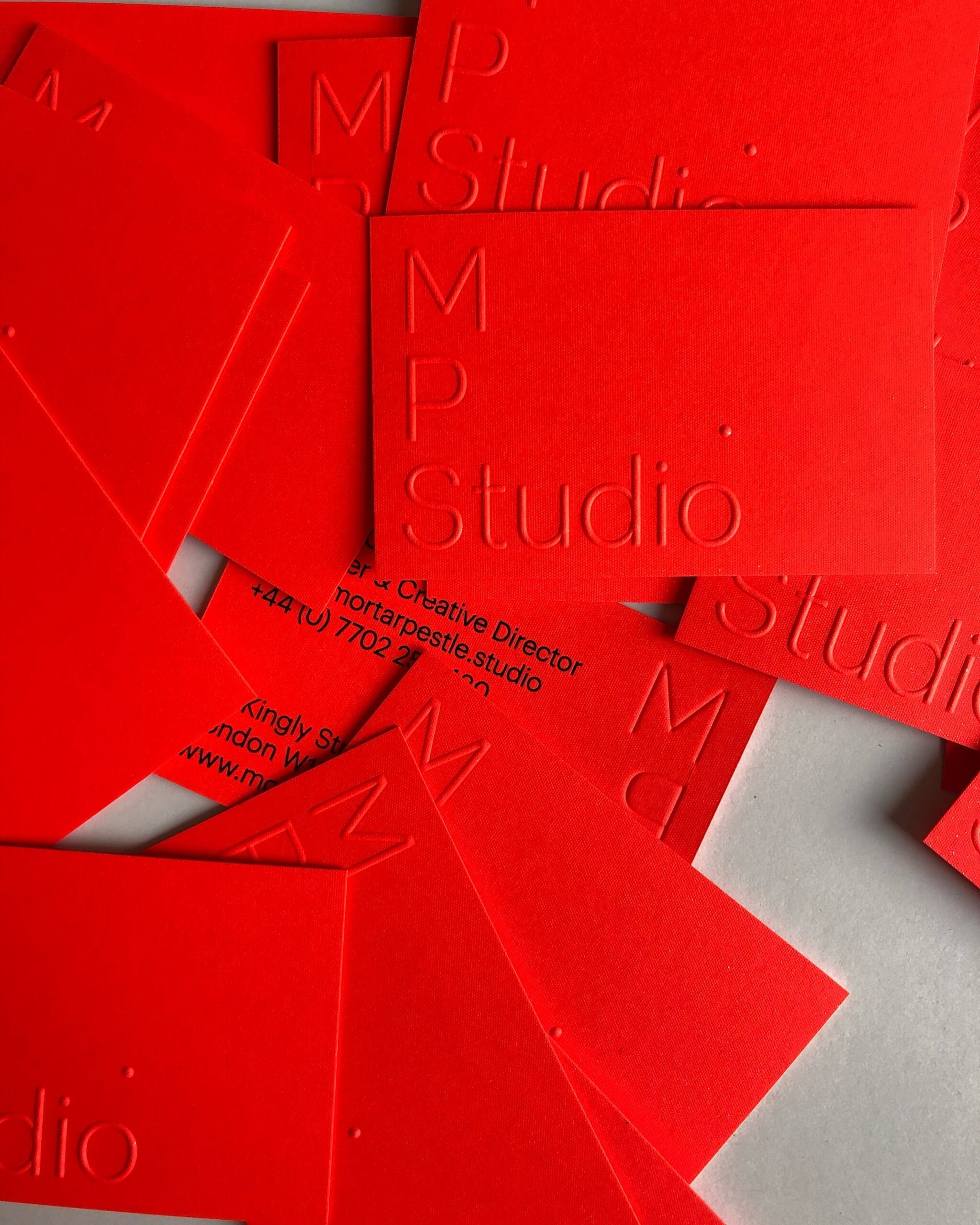
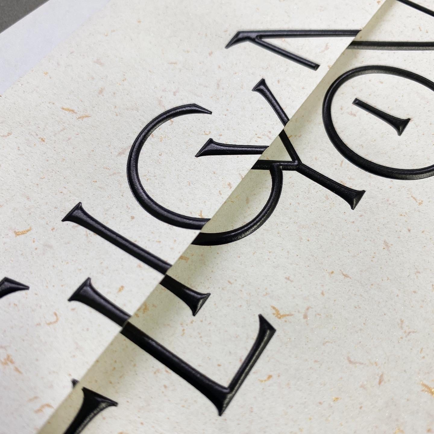
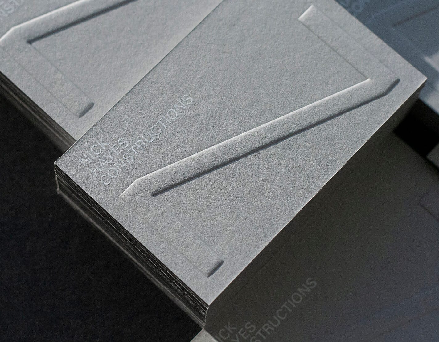
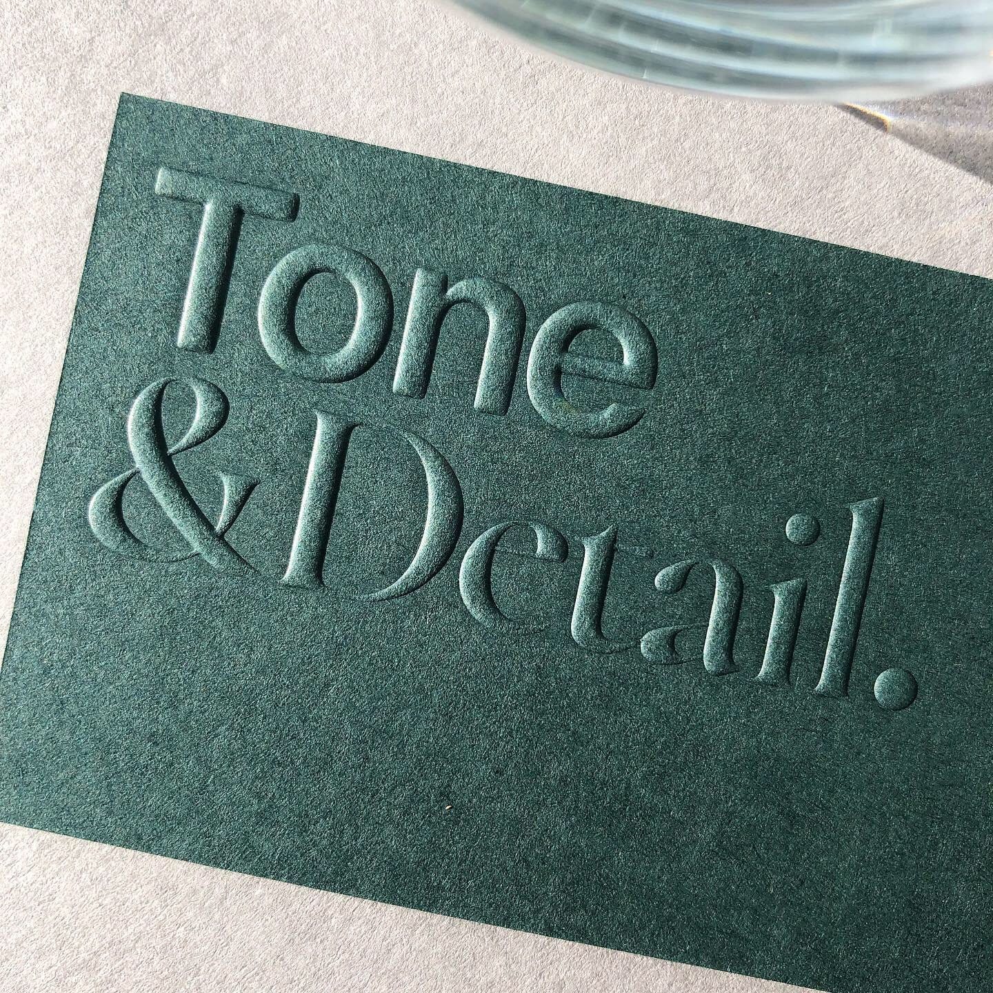
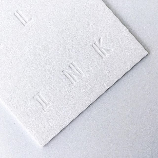
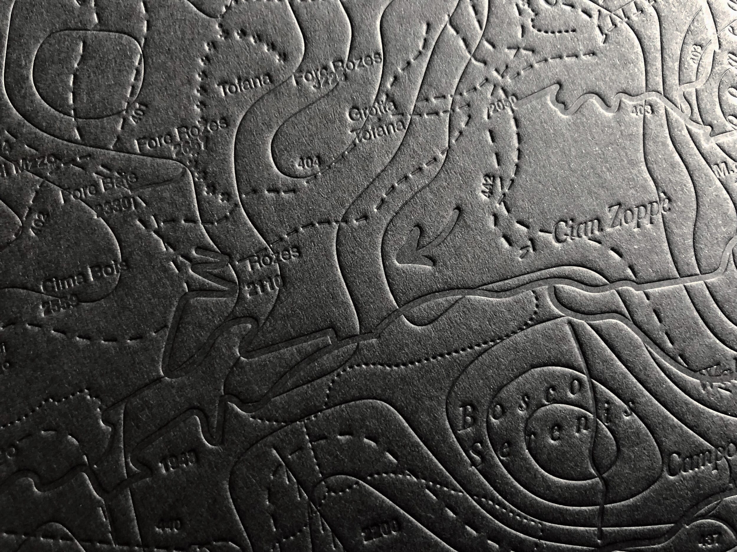
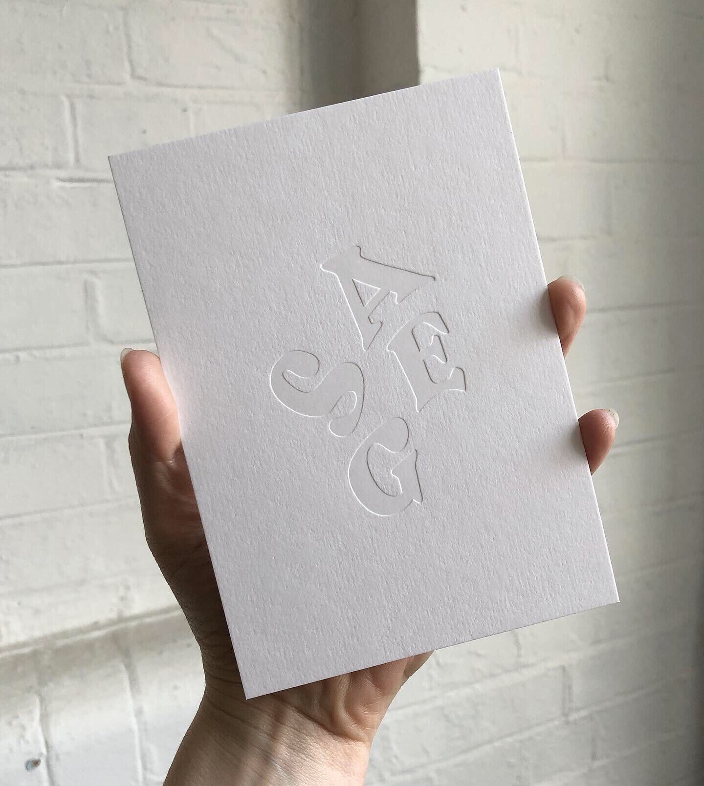
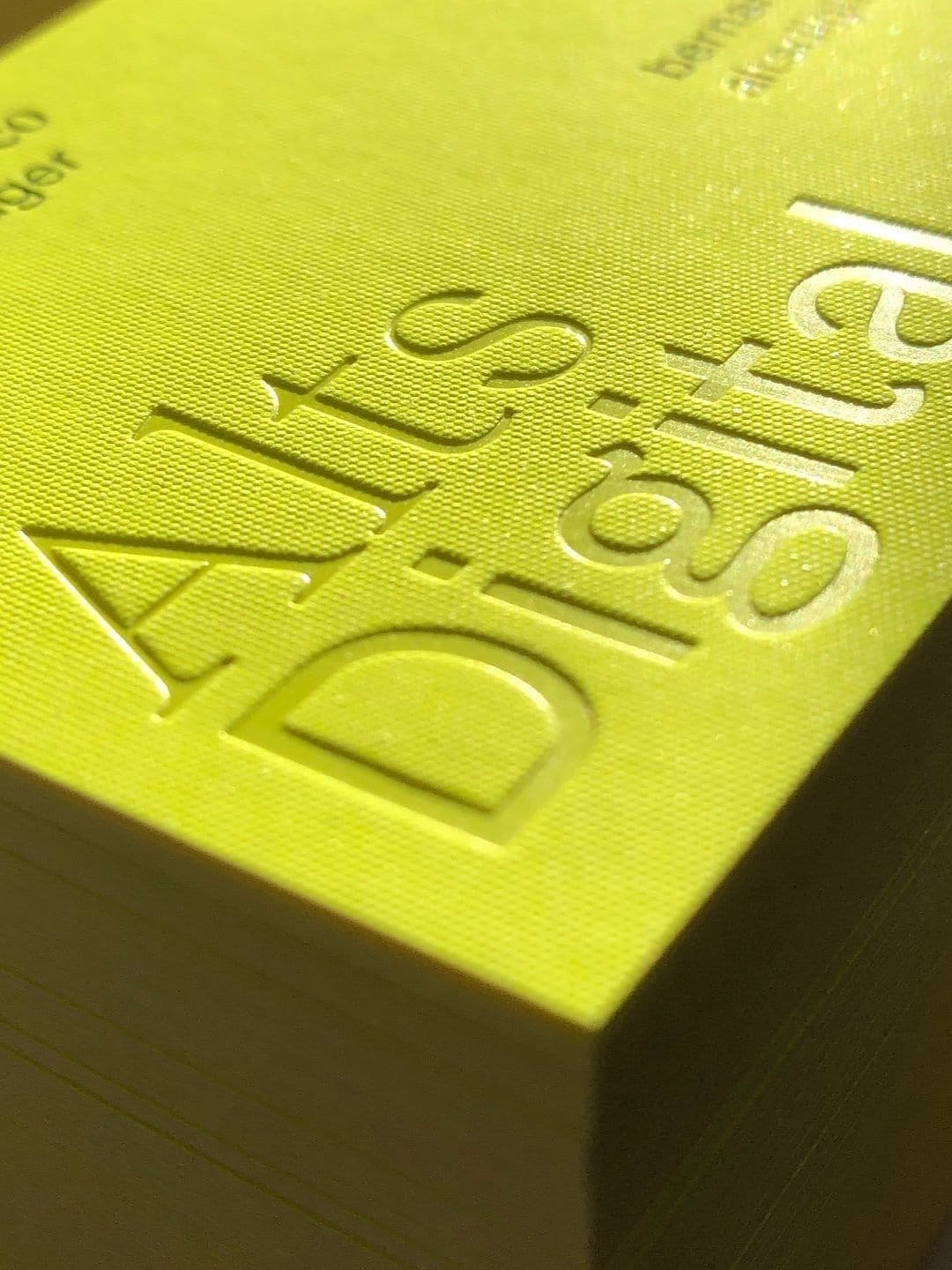
Exceptional Post-Printing Techniques to Elevate Your Packaging Quality
FAQ - Custom Packaging Services
Do you provide one-stop services from design to production?
Yes, we offer end-to-end services, including packaging design, sampling, and mass production, ensuring every step meets your brand’s needs.
Where is your production facility located?
We are a professional packaging manufacturer based in China, equipped with advanced production technology and extensive export experience to serve global clients.
What is the lead time for custom packaging?
Design and sampling typically take 3-5 business days, while mass production takes 7-15 business days, depending on order quantity and complexity.
How is the pricing determined?
Our pricing is based on materials, dimensions, processes, and quantity. We can also provide FOB or CIF quotations tailored to export requirements, ensuring budget compatibility.
What types of packaging materials do you offer?
We provide a variety of materials, including rigid cardboard, corrugated paper, kraft paper, specialty paper, food-grade paper, waterproof paper, and eco-friendly options like recycled and biodegradable PLA.
What eco-friendly options are available?
We focus on sustainable packaging solutions, offering recyclable and compostable materials, and use eco-friendly inks like soy-based and water-based inks.
Can you create high-end packaging with advanced finishes?
Yes, we offer advanced finishes such as foil stamping (gold, silver, holographic), embossing, debossing, spot UV, and matte lamination to enhance the premium feel of your packaging.
Can you customize the interior structure of the packaging?
We provide various interior design options, such as foam inserts, cardboard dividers, velvet linings, or plastic trays, to protect your products effectively.
What printing techniques are available?
Our printing techniques include offset printing, UV printing, digital printing, and screen printing, delivering high-definition designs and diverse visual effects.
Are your materials internationally certified?
Yes, all our materials meet international safety, environmental, and quality standards, including FDA-certified food-grade materials, suitable for various industries.
Can you create unique shapes or special die-cut designs?
Yes, with our advanced die-cutting equipment, we can produce unique packaging shapes that align with your brand’s identity and customization needs.
Is it possible to add a transparent window to the packaging?
Yes, we can design transparent PVC or PET windows on the packaging to enhance product visibility while maintaining structural integrity.
Do you provide waterproof or moisture-resistant packaging?
Yes, through coating treatments and special materials, we can offer waterproof and moisture-resistant packaging to meet specific product requirements.
How do you ensure the final product meets expectations?
We provide sampling services so you can approve the sample before proceeding with mass production, ensuring the packaging fully meets your requirements.
Can you provide samples?
Yes, we can provide material and finish sample kits to help you select the most suitable solution for your needs.


Reviews
There are no reviews yet.