
How to get custom packaging boxes with my brand color?

Some packaging boxes look beautiful in a digital design, but the printed version can turn out much darker than expected. A brand’s blue may become grayish blue, while a vibrant green may lose its original brightness and identity. The problem often lies not in the design itself, but in the differences between screen displays, paper materials, and printing methods. When customizing packaging boxes, achieving consistent brand colors requires more than simply sending a logo image to the manufacturer. Confirming color codes, paper types, and finishing options in advance, then checking a physical sample, can help reduce color discrepancies and maintain a more consistent appearance across production batches.
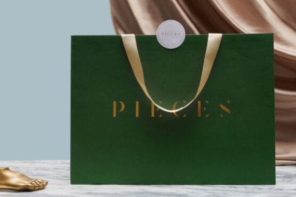
How Can You Reproduce Brand Colors Accurately on Custom Packaging Boxes?
The most important step in customizing packaging with brand colors is to establish a clear color standard. A designer’s screen can serve as a reference, but screens display colors using light, whereas printed boxes rely on ink reflecting light. Even when the same design file is used, changing the paper stock or surface finish can affect the final appearance.
During production, consider the following steps:
- Provide standard color codes: If your brand already has Pantone references or CMYK values, specify them clearly in the design files instead of relying on visual descriptions alone.
- Confirm the paper type: White cardboard, coated paper, and kraft paper have different base colors and ink absorption characteristics. The same ink can look different on each material.
- Specify surface finishes in advance: Matte lamination, gloss lamination, and foil stamping can affect surface reflection and texture. These details should be considered during sampling.
Maintain consistent color standards across packaging components: If the outer box, inner tray, and other paper packaging need to look coordinated, confirm the materials and color requirements for each component before production.
CMYK vs. Pantone: Which Printing Method Is Better for Brand Packaging?
These two printing methods frequently appear in packaging quotations and design files, but they serve different purposes. CMYK combines four inks—cyan, magenta, yellow, and black—to reproduce images and colors. It works well for product photography, multicolor graphics, and gradients. Pantone spot colors use specially mixed inks to reproduce specified colors, making them useful when a brand’s signature color requires closer control.
The right choice depends on the design, color requirements, and production budget. Using spot colors for every element is not always necessary, even when color accuracy is important.
| Comparison | CMYK Four-Color Printing | Pantone Spot-Color Printing |
| Printing method | Combines four inks to reproduce colors | Uses specially mixed spot-color inks |
| Best suited for | Product photos, multicolor graphics, and gradients | Logos, solid-color backgrounds, and signature brand colors |
| Main advantage | Handles complex and colorful artwork | Helps maintain consistency for specified colors |
| Considerations | Some colors may not perfectly match their appearance on screen | Additional spot colors and plate requirements may increase costs |
If your packaging includes both product photography and a brand color that needs close control, you can combine CMYK printing with Pantone spot colors. This approach supports detailed graphics while giving the signature brand color more attention, without restricting the entire design to one printing method.
What Causes Color Differences in Custom Packaging Box Printing?
Color discrepancies do not always mean the printing equipment has malfunctioned. In many cases, the materials, finishing options, or approval standards were not clearly defined before production. It is better to address color matching during sampling than to discover problems after thousands of boxes have been printed.
- Relying only on digital mockups: Different monitors may have different brightness and color settings, so the colors displayed on screen should not be treated as the final printing standard.
- Ignoring the paper’s base color: White cardboard generally produces brighter-looking colors, while brown kraft paper can make some colors appear darker or more muted.
- Overlooking lamination effects: Gloss and matte finishes reflect light differently. The same printed color may look different after the surface treatment is applied.
- Skipping sample approval before mass production: Once the physical sample is approved, document the color, material, and finishing requirements to reduce misunderstandings during production.
For brands that reorder the same packaging regularly, it is also useful to retain an approved physical sample and the relevant printing specifications. This provides a clear reference for future production runs instead of relying on visual estimates each time.
How Can Sampling Help Confirm Your Brand Colors?
The best way to evaluate brand colors is to view them on the actual paper under real lighting conditions. Once the design files are approved, request a digital proof or printed sample to check the logo, background colors, small text, and graphic details. If color accuracy is especially important, confirm the printing method and surface finish before mass production, and keep the approved sample as a reference for future orders.
During sample approval, focus on three key areas: whether the colors match the brand standard, whether the text and graphics remain clear, and whether the overall appearance works well after lamination or foil stamping. If similar brand colors need to appear on different materials, test each material separately rather than assuming the same color code will look identical on every surface.
Custom packaging boxes with brand-specific colors require clear decisions about color codes, paper stock, printing methods, and surface finishes before production begins. Physical sample approval then helps confirm the final appearance. INS PACKAGING provides custom packaging boxes, color planning, print sampling, and mass production services. We can help plan materials and printing specifications around your brand’s visual requirements to support consistent packaging appearance across production runs and repeat orders.

