The Art of Playing Card Packaging Design: Custom Pocket Aces Packaging
Kambiz Ahmadi designed Pocket Aces’ first product for high-end gaming supplies company Pocket Aces—the Pocket Aces playing cards. The packaging comes in a minimalist yet stylish black box with a striking “X” logo on the front. The brand cleverly omits its logo, emphasizing its “no-brand” nature. The gold-stamped edges of the cards echo the gold-stamped finish on the box, enhancing the overall experience of the product and packaging. Just like the game of poker, excellent packaging design requires courage, focus, and thinking outside the box; judging from this deck’s design, Kambiz clearly possesses these three qualities.
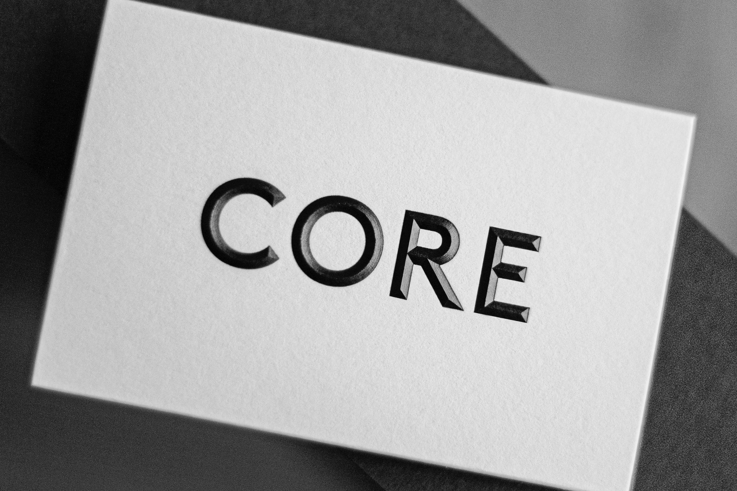
Pocket Aces challenges the traditional concept of custom packaging, emphasizing simplicity and elegance. The box itself acts as a canvas, showcasing the brand’s core spirit. The oversized “X” logo breaks with typical brand norms, aiming to pique consumer curiosity while aligning with the essence of luxury.
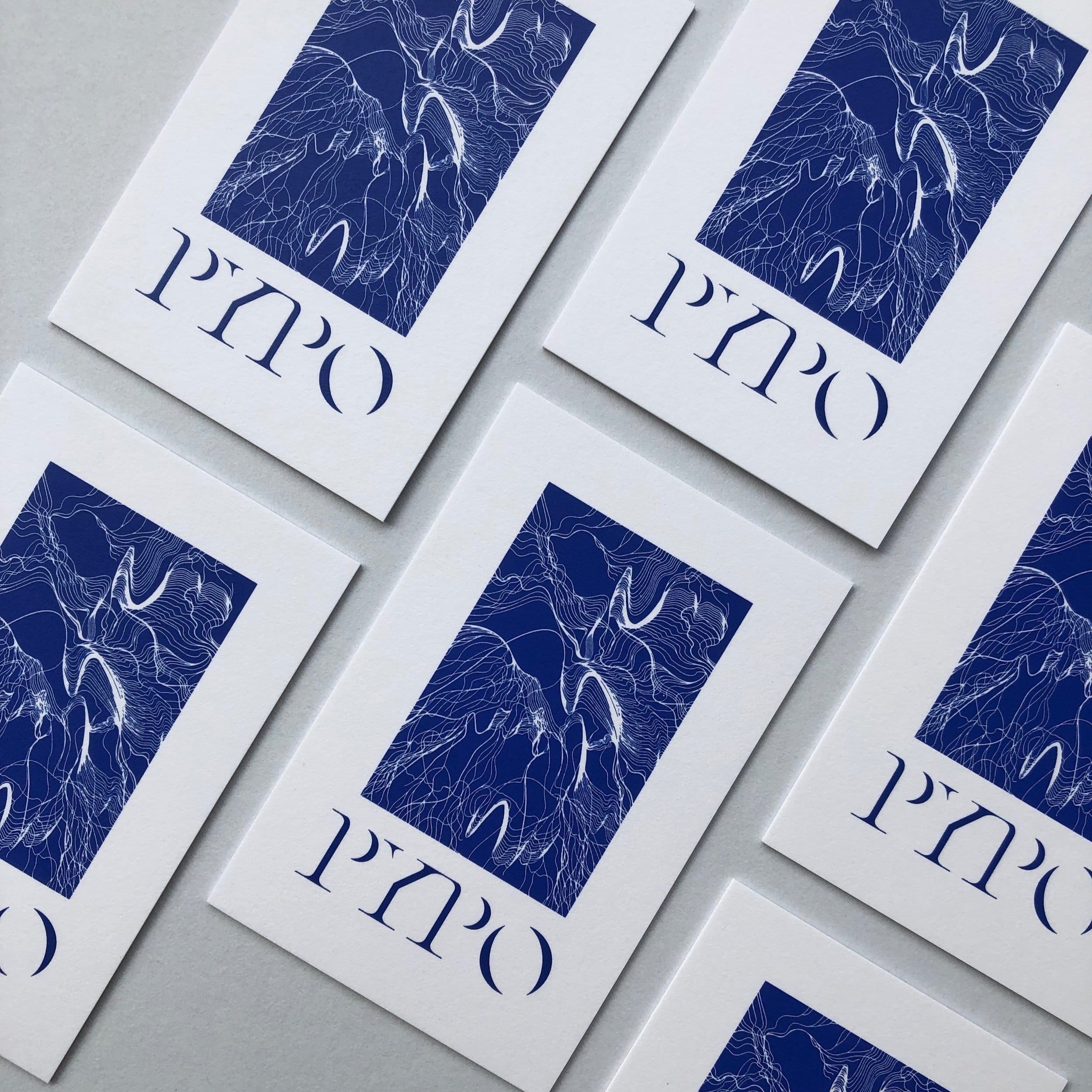
This minimalist deck of cards was developed in tandem with the overall brand identity, and the packaging played a crucial role in testing the brand identity and how it integrates into the product experience. The oversized “X” on the front and back of the box serves as a placeholder for where the brand identity would typically be. While we use the “X” to represent ourselves, its true purpose is to emphasize the absence of a brand identity. We aimed to make the product itself a complete experience through the clever use of color, materials, and minimalist graphic aesthetics, highlighting every subtle material detail.
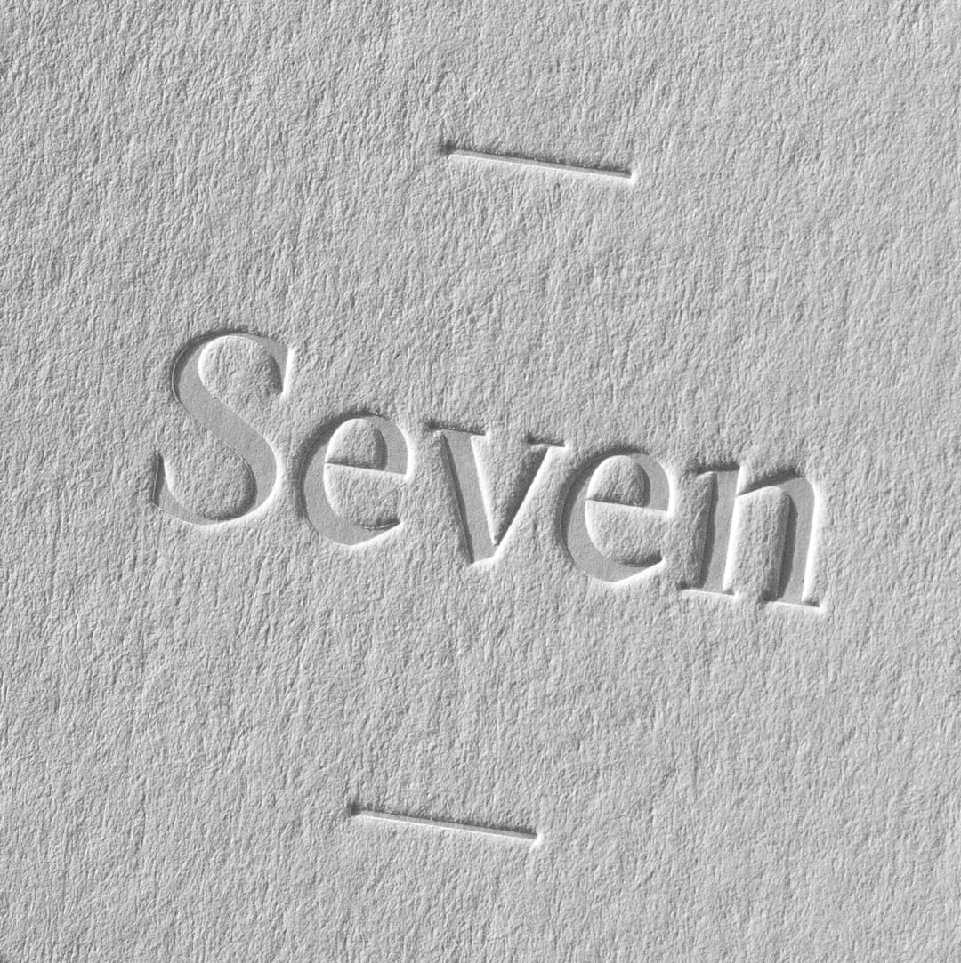
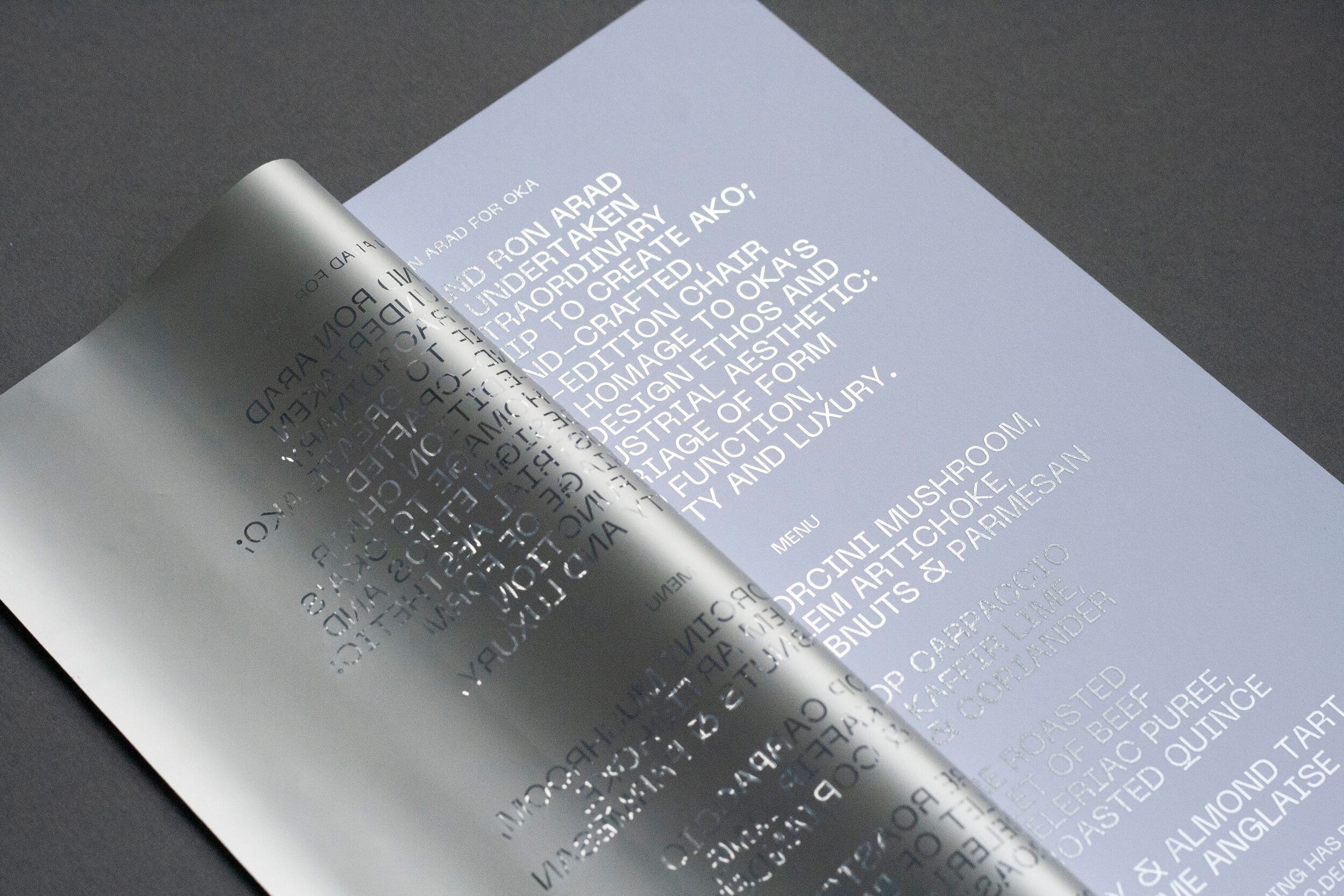
To this end, the packaging uses solid cardboard in a deep navy blue, covered with a film as soft as rose petals. Each surface of the packaging features a unique message printed in copper foil, contrasting sharply with the matte cardboard and adding a touch of shine. This design philosophy is also fully reflected in the design of the deluxe box, which perfectly blends aesthetics and practicality, ensuring that every detail of the product enhances the user experience.
This contrast becomes even more pronounced when the packaging is opened and the deck is revealed. The copper-plated edges of the cards echo the copper foil on the packaging, further enhancing the packaging experience. Packaging is not a standalone element, but an integral part of the product and the experience. The subtle use of copper and navy blue on both the playing cards and the packaging creates a harmonious aesthetic, attracting consumers’ attention and setting a new benchmark for high-end playing card packaging.
The card backs are also adorned with copper foil, cleverly utilizing the “X” pattern seen on the front of the packaging to create a design known as the “pocket hatch.” This attention to detail creates an elegant visual effect that permeates the entire playing experience. Similar to its application on the packaging, these “X” patterns are designed to highlight areas typically used for elaborate designs. The same material is used on the front of the cards, with carefully designed numbers and indices presented in copper foil against a deep navy blue background—inspired entirely by the packaging design.
Exquisite products not only meet consumer needs but also evoke emotions and generate excitement. This is particularly evident in the perfect fusion of Pocket Aces’ gift packaging philosophy and overall design language. Receiving a deck of cards is more than just receiving a deck; it’s the beginning of a complete experience from the moment you hold the packaging. This meticulous design guides users to further explore the product and immerses them in a multi-sensory experience.
The navy/bronze version of these cards will be available from April 27th, with navy/magenta and navy/silver versions to follow. This forward-thinking release reflects the brand’s commitment to providing a balanced experience that combines aesthetics and practicality. It showcases the art of high-end gift packaging without compromising the cards’ inherent quality.
In today’s rapidly evolving product design landscape, Pocket Aces playing cards stand out by skillfully blending simplicity and complexity in their design strategy, becoming a model for other brands. This luxurious deck and its meticulously designed packaging once again exemplify the truth of “less is more.” Pocket Aces’ emphasis on user experience, material quality, and innovative design has secured its significant position in the high-end gaming supplies market.
In short, the entire process of conceiving and finalizing the Pocket Aces playing cards perfectly embodies the modern design philosophy of balancing form and function. Pocket Aces redefines the role of custom and luxury packaging, incorporating unique aesthetic elements to create more than just a product; it delivers an unforgettable experience. As the gaming industry continues to evolve, we can certainly expect brands like Pocket Aces to lead trends and continuously raise the standards for product design, packaging, and ultimately, the user experience.
Order Process
Ins Packaging
Typically replies within a day
Hey, Do you want to talk with us?
Step-by-Step Guide to Custom Packaging Boxes from China
Efficient shipping logistics ensure timely delivery of your order worldwide.
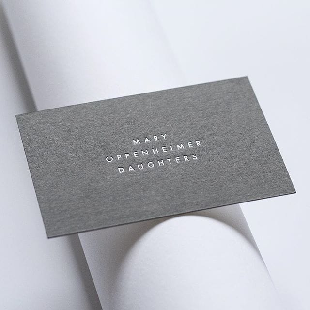
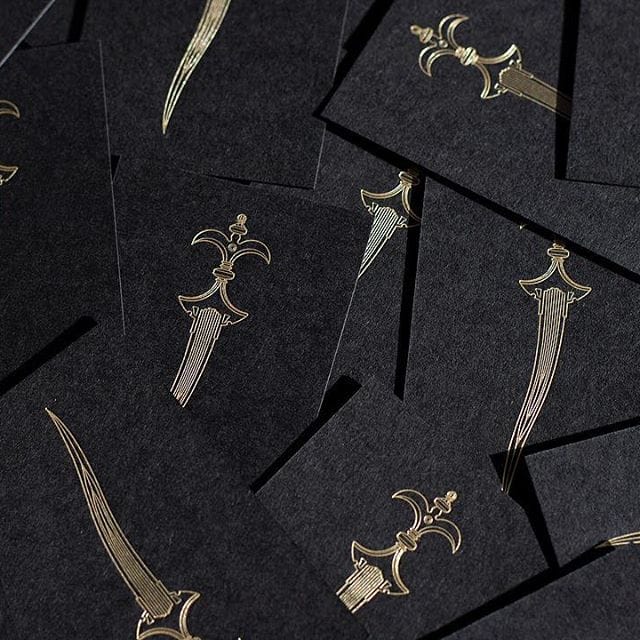
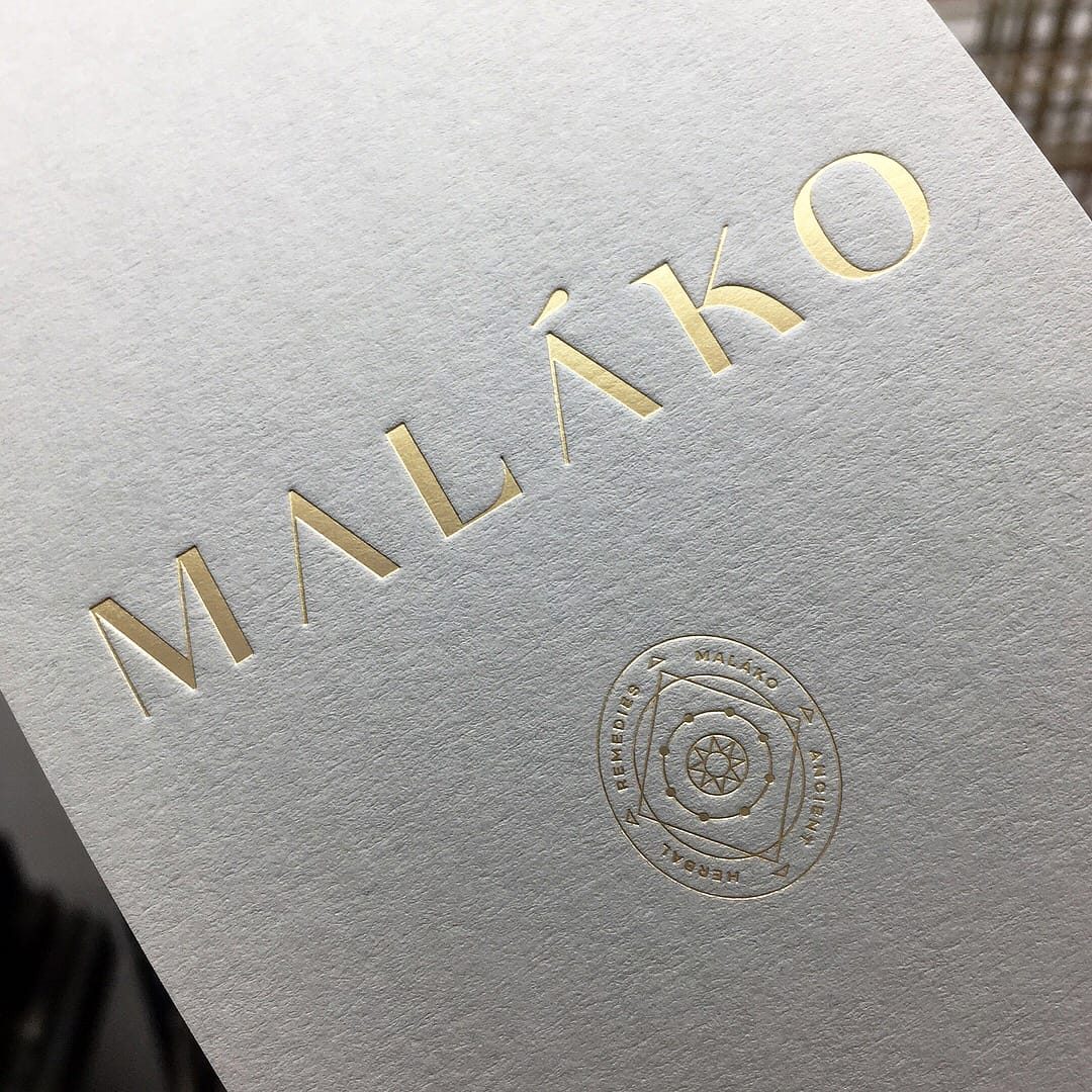
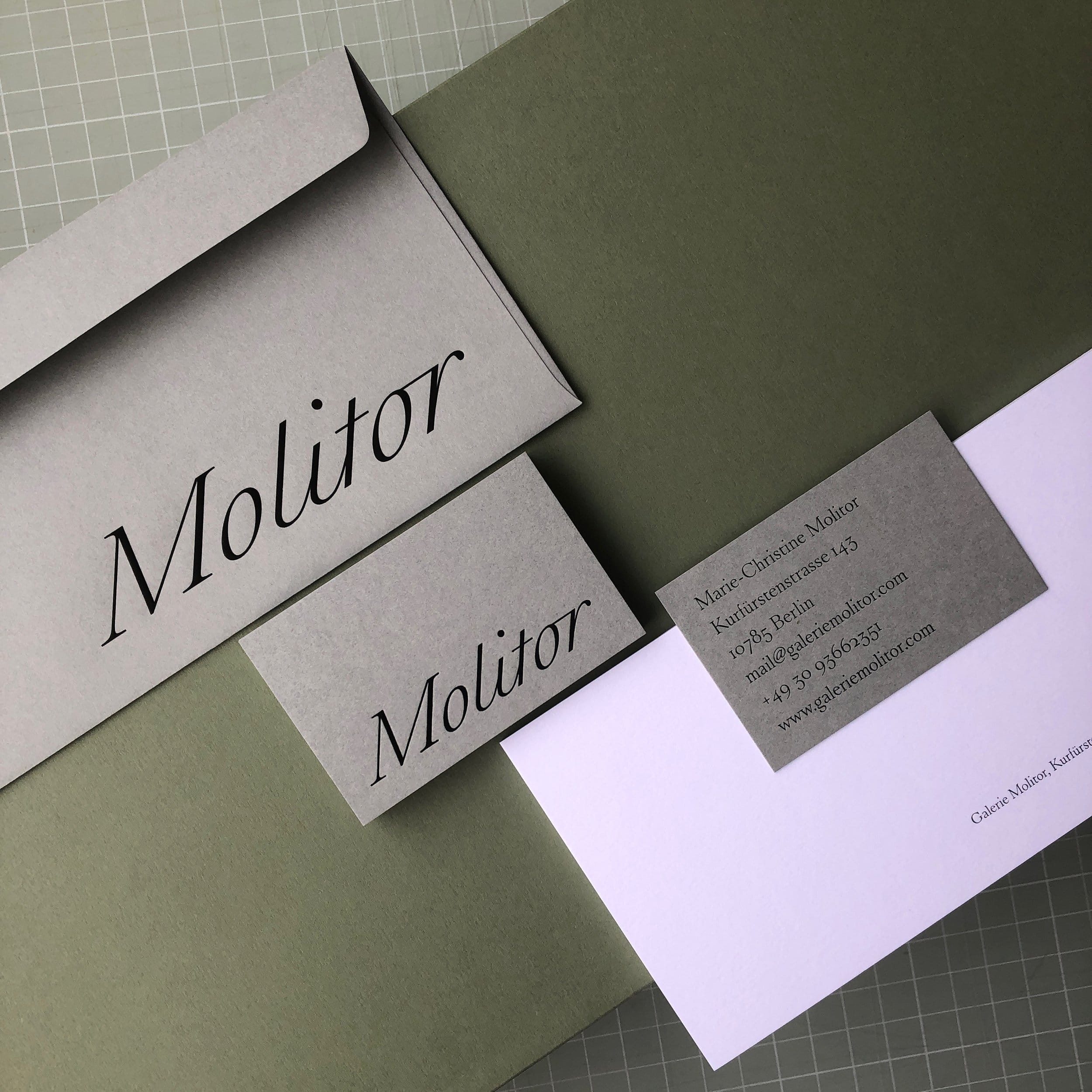
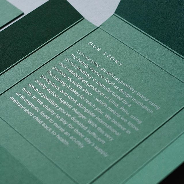
Exceptional Post-Printing Techniques to Elevate Your Packaging Quality
FAQ - Custom Packaging Services
Do you provide one-stop services from design to production?
Yes, we offer end-to-end services, including packaging design, sampling, and mass production, ensuring every step meets your brand’s needs.
Where is your production facility located?
We are a professional packaging manufacturer based in China, equipped with advanced production technology and extensive export experience to serve global clients.
What is the lead time for custom packaging?
Design and sampling typically take 3-5 business days, while mass production takes 7-15 business days, depending on order quantity and complexity.
How is the pricing determined?
Our pricing is based on materials, dimensions, processes, and quantity. We can also provide FOB or CIF quotations tailored to export requirements, ensuring budget compatibility.
What types of packaging materials do you offer?
We provide a variety of materials, including rigid cardboard, corrugated paper, kraft paper, specialty paper, food-grade paper, waterproof paper, and eco-friendly options like recycled and biodegradable PLA.
What eco-friendly options are available?
We focus on sustainable packaging solutions, offering recyclable and compostable materials, and use eco-friendly inks like soy-based and water-based inks.
Can you create high-end packaging with advanced finishes?
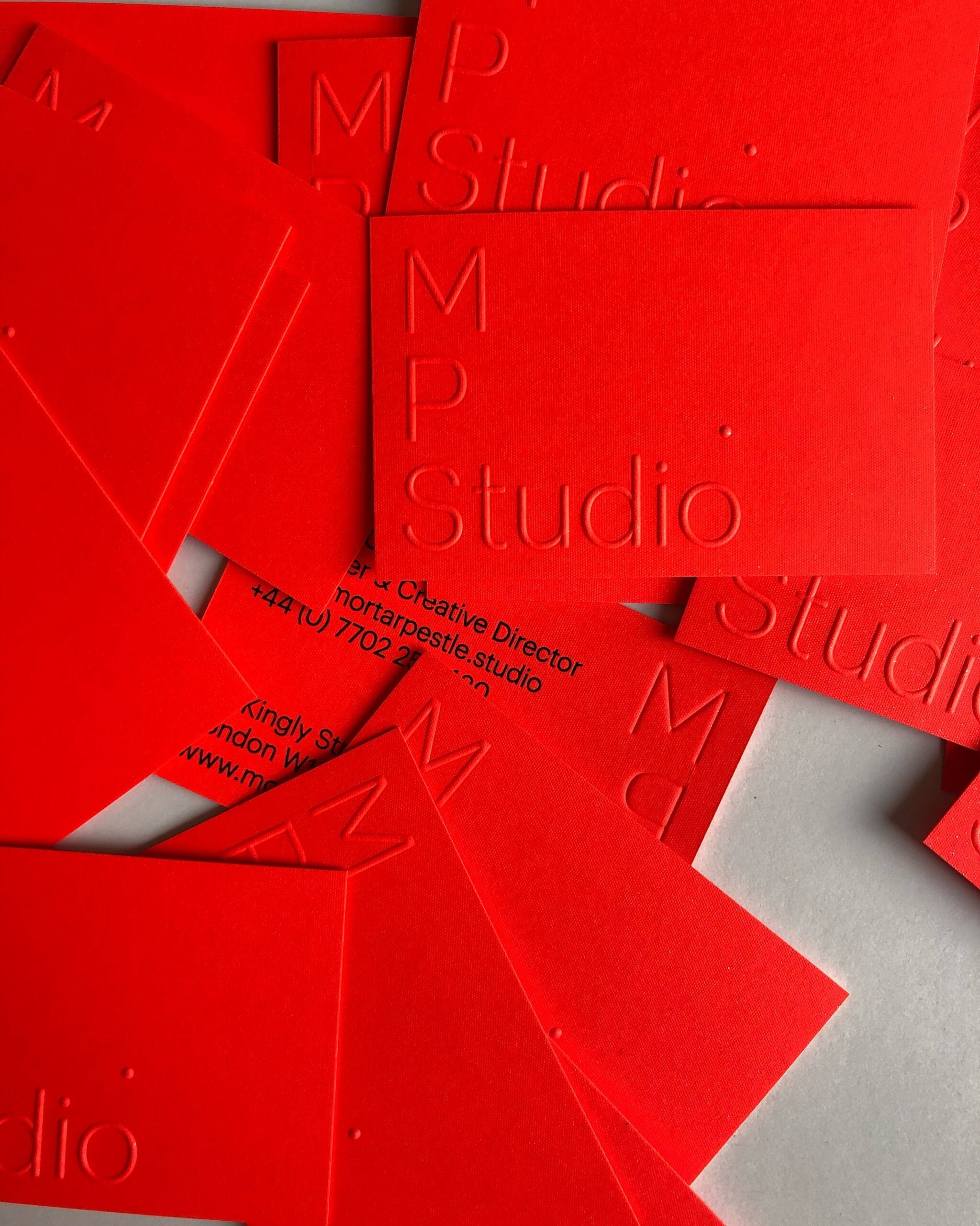
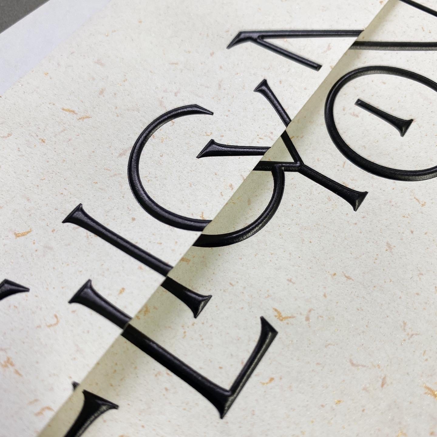
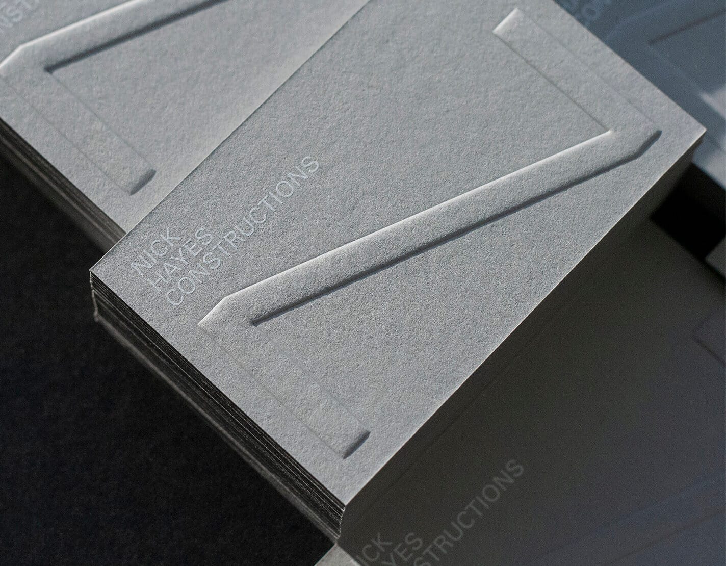
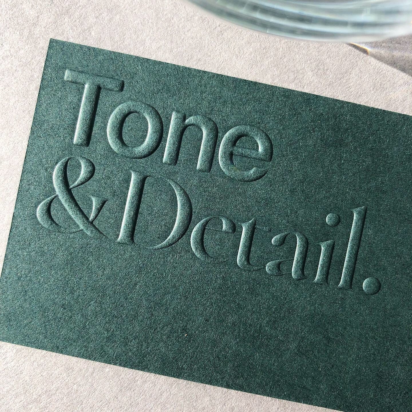
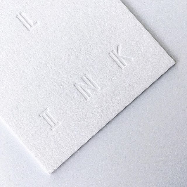
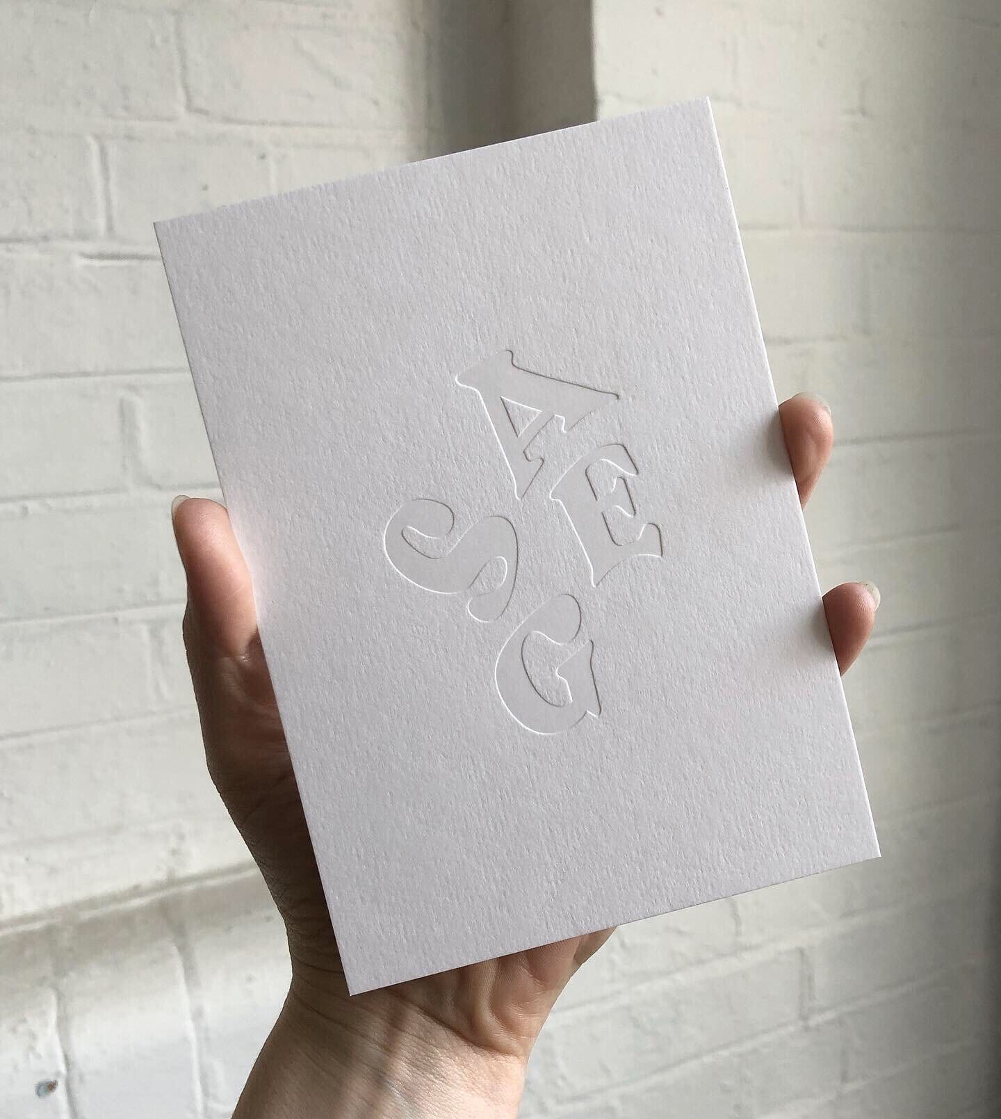
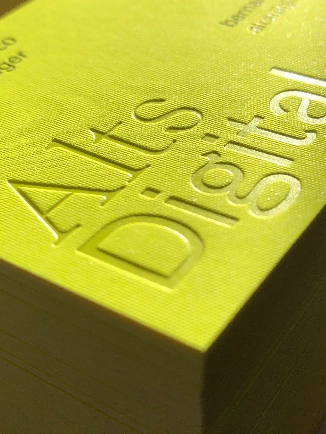
Yes, we offer advanced finishes such as foil stamping (gold, silver, holographic), embossing, debossing, spot UV, and matte lamination to enhance the premium feel of your packaging.
Can you customize the interior structure of the packaging?
We provide various interior design options, such as foam inserts, cardboard dividers, velvet linings, or plastic trays, to protect your products effectively.
What printing techniques are available?
Our printing techniques include offset printing, UV printing, digital printing, and screen printing, delivering high-definition designs and diverse visual effects.
Are your materials internationally certified?
Yes, all our materials meet international safety, environmental, and quality standards, including FDA-certified food-grade materials, suitable for various industries.
Can you create unique shapes or special die-cut designs?
Yes, with our advanced die-cutting equipment, we can produce unique packaging shapes that align with your brand’s identity and customization needs.
Is it possible to add a transparent window to the packaging?
Yes, we can design transparent PVC or PET windows on the packaging to enhance product visibility while maintaining structural integrity.
Do you provide waterproof or moisture-resistant packaging?
Yes, through coating treatments and special materials, we can offer waterproof and moisture-resistant packaging to meet specific product requirements.
How do you ensure the final product meets expectations?
We provide sampling services so you can approve the sample before proceeding with mass production, ensuring the packaging fully meets your requirements.
Can you provide samples?
Yes, we can provide material and finish sample kits to help you select the most suitable solution for your needs.


Reviews
There are no reviews yet.